
Thursday, 26 February 2015
Thriller Soundtrack Research
To help us decide what music we should use during our thriller opening, Felicity and I decided to listen to the soundtrack of other thriller openings and see what type of music was used during these.
First, we looked at the soundtrack to 'The Sixth Sense' (Shyamalan, 1999), composed by James Newton Howard;
The music in The Sixth Sense is very low and droned. This is great at creating suspense. The sudden change in music at 39seconds made us jump which, hopefully, it would do this for the audience as well. I think that this is a very good choice of music as it builds tension and enigma, which is key within thriller films. The slow tempo also helps to build tension and keeps the audience on their seat.
Next we looked at the soundtrack to 'Law Abiding Citizen' (F. Gary Gray) composed by Brian Tyler;
This soundtrack again starts off very slow and quiet. It then starts to get louder and quicker, this indicates when the action is about to start. The instruments and software that are used in this soundtrack are great at creating the suspense and setting the tempo of the film. However, this piece was made with a 52-piece hollywood symphony orchestra, and due to limited funds and resources there is no way we will be able to make a piece of music like this.
Wednesday, 25 February 2015
Titles and Credits
Film Titles

From my research i found that many thrillers have big bold titles and are mainly white, black or red (colours that are just as bold as the writing). Furthermore many of the thriller titles were either one word or two, this made them short and snappy and in one way or another told us something about the film. In addition the background of the titles are either black or white, this just sets a very serious mood and doesn't give too much away.
Film Credits

I also looked at the different credits in thrillers, i found that all the writing was very simple and in most of the thrillers i saw that the credits were all in white with a black background. The actual text of the credits was very simple and small and each credit got its own queue, this meant that all the important people were acknowledged and it also created a slower more tense and suspicious feel to the film.
Our Film title and credits

After all our research we decided to conform to the normal thriller titles and credits. We decided on a big and bold but short title so that we could have something eye catching without giving too much away. Furthermore we also decided that our credits would be very simple text so that the mysterious mood of the film wasn't being distracted by big silly text. However we decided that our credits would just fade in during the second half of our opening due to the fact that putting each credit on its own black screen would break the flow of our opening and would look really awkward and messy.


Director
Producer
Editor
Actors
Tuesday, 24 February 2015
Soundtrack Research- Felicity
Soundtrack Research for the opening to our film
From Shannon's research on Thriller film soundtracks, our group have gathered ideas on what type of music and sounds we want to include in the opening to our film.
We have experimented with different music and sounds on programmes such as 'garageband' and 'logic x pro', to create drones and background noise to fit with each scene. We want our thriller to have strong elements of excitement and suspense so the music will help create this and add to the atmospheric feel of the opening.


We decided not to use garageband and went on youtube:
For our music, we found 3 different soundtracks on youtube which were copyright free and got others opinions on them.
1. https://www.youtube.com/watch?v=-sSVQrnvyIk
2. https://www.youtube.com/watch?v=NWaNW-aYhVY
3. https://www.youtube.com/watch?v=P5vguMSFwxQ
A lot of people said they preferred the first piece of music as it fitted more with the thriller genre and created more suspense. The other two did not conform as much to the Thriller genre and we were told that it may not fit with the opening to our film. When it came to the editing process, we did some experimenting and found that number 1 and 3 actually matched each other well and created great suspense and tension within our opening. We were told that when the music started to play, the build up helped create tension and a slight uncomfortableness for the audience members which is what we were trying to achieve.
The music really improved that part of our opening and made the clip much more intense to watch. The gradual build up helps conform to the typical thriller opening and allowed the audience to be more frightened and concerned to what was about to happen next.
Our Production Logo
 X Production
Our production logo has a black background, this is because on our research of the production logos it shows how a lot of the thriller films production has black background behind the logo, therefore we thought it was a good idea to use a black background as it goes with the thriller of our film to create it more spooky for the audience instead of the background being white or a bright colour.
For our production logo we wanted to create a more dramatic logo however a lot of our ideas for the logo was to complex to create as we weren't allowed to copy write therefore we went with a logo which we used the letter 'X', which is presented very bold with the dark blue and the light blue together. We thought of using the colour green for our production logo however we thought that the colour blue was more mysterious in a way to fit the thriller opening. Overall we are pleased with our production company for our opening thriller.
Production Company Logo Research
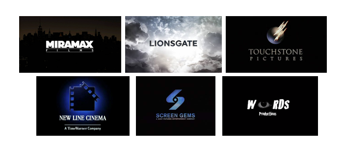
I went into google and typed in 'thriller production company logos' and many results came up, here is an example of just a few;


All of these logos have a dark background. This is a good colour choice as it as to the mystery and tension that is in thriller films. The dark background helps to create enigma, a key factor within thriller films. It helps to grip the audience and keep them wondering from the start. 3 of the 8 logos have the colour red include within their logo. This is a very good choice of colour as red stands for blood and danger, two factors that are usually incorporated in thriller films.
I then went on to look at what big Hollywood production company logos looked like;

All of the big Hollywood production company logos have a unique design with a catchy name and bright colours to catch the audience's eye. They are all quite simple swell. None of the designs are over complicated or packed with images or words. the simplicity of the logos is what makes them eye catching and memorable to the audience.
However, these of course were not the first designs that the production company would have come up with. They would have gone through many different designs, changing them every single time, even if the change was drastic or only small. The final designs, in some cases, would be totally different to the initial idea. The companies would have to ensure that the logo they would like to use, they can actually use, by making sure that the image they would like is not copyright, or by designing their own image.
The design of the logos have also changed over the years. The companies would have published a logo, but as the years progress, so do the logos…
Progression of the 20th Century Fox Logo:
1935-1960s

1935-1966
1953-1987

1981-1994

1994-2010

2009-2013

2013-Present
.png)
This link shows the progression of the 20th Century Fox logo and why and how the production had to change the logo: http://logos.wikia.com/wiki/20th_Century_Fox
I then went on to look at Independent production company logos…


The independent production company logos are a lot simpler then the big hollywood ones. They also have a lot less colour than the hollywood ones. Even though they are a lot simpler than the hollywood logos, this is what ultimately makes them very mysterious and eye catching. The lack of colour also does not draw the audience's attention away from the design and writing itself. Even though they are just independent logos, they still have to make sure that their designs are unique and whatever pictures they would like to use are not copyright or are original.
Research; Production Logos ( Felicity )
Hollywood Film Production Company Logos

Most of these logos are bright and eye catching by including unique images and logos, so they are memorable by audiences. They have simple yet bright colours which also add to the attraction needed by audiences.
Independent Film Company Logos


These are logos from independent film companies which may not be as recognisable to audiences. They all have quite different designs, mainly including bold writing to stand out.
Thriller Company Logos

These logos are from thriller production companies. Its obvious to see that they all have a dark or completely black background which fits into the thriller theme, and are very simple so its easily recognisable to audiences worldwide.
Research - Production Logos (Jessica Fernando)


The above images are production logos that are specifically used for mainly thrillers, this is because of the dark background on each image, which creates a thriller look, it therefore creates a thriller atmosphere with the dull dark colours. The ideas of these production logos will help us to create our logo to fit the thriller genre.
Research- Production logos

Hollywood Film Production companies
These logos are very bright and some have both writing and pictures. these logos stand out as they use bright colours like yellow or blue and bold writing. I think because of the bright colours and bold writing these logos are much more eye catching and more interesting to look at.

Independent Film Production companies
These logos are much darker in colour and much more simple that those of the Hollywood logos. However I think that the simple design works well and is still pleasing to the eye. Furthermore these logos are mainly words with a very simple image or shape.
Thriller Film Production companies
For the thriller logos i found that they were all very dark in colour; i think that this is a great look for thriller logos as it sets a dark yet mysterious mood and makes the audience get into the mood of watching a thriller.
Overall i think all the logos are attractive to the eye in different ways, and each logos set different moods which are through the use of colours, words or pictures. All the logos are simple enough and there is not too much going on in them which just looks a lot better. For our group film logo i think i would like to create a dark coloured logo with an image which stands out but that is simple. Furthermore i want our logo to set that dark suspicious mood for the thriller opening.
3 Point Lighting and Experimenting with Filters

Key Light: This is the main light. It is usually the strongest and has the most influence on the look of the scene. It is placed to one side of the camera/subject so that this side is well lit and the other side has some shadow.
Fill Light: This is the secondary light and is placed on the opposite side of the key light. It is used to fill the shadows created by the key light. The fill will usually be softer and less bright that the key. To achieve this, you could move the light further away. You might also want to set the fill light to more of a flood than the key.
Back Light: The back light is placed behind the subject and lights it from the rear. Rather than providing direct lighting (like the key and fill), it purpose is o provide definition and subtle highlights around the subjects outlines. This helps separate the subject from the background and provide a three-dimensional look.
Some of the filters we used were:
Soft filter
Light orange filter
Strong orange filter
Red fiter
Purple filter
Translucent filter
Light green filter
Dark blur filter
We also used the LED lights to add some backing lighting, to create more shape of the person in front of the camera.
Group Pitch And Audience Feedback
'The Missing'
For this task, our group came up of a thriller opening in which we presented in front of our class, and were given back feedback from our opening. Our ideas for this thriller opening came from our mini pitch's in which we all used parts of our own ideas to create our main pitch. Our feedback was positive as a lot of people liked the idea of the opening to start with a girl vlogging herself. Many people gave us ideas to add in to our opening to make it more thriller like, this included the idea to film the the girl vlogging and cutting back to the CCTV scene whilst the girl is talking. some said that the flash backs may confuse people; with the use of transitions throughout the flashbacks, it will make it easier for people to understand that it is flashbacks. Overall, our audience feedback was very helpful.
Mini pitch
My original idea for our thriller opening:
A normal teenage girl is shopping or walking down the street and she slowly starts to sense that someone is following her. Every time she looks behind her or in a reflection of some sort she see's shadows like there is someone there, and keeps questioning herself as to whether she is imagining it all. Then there are flashbacks shown, which gradually become shorter clips which speed up, of her clearly being followed. The opening scene ends with a blackout, then as the camera is zoomed into the main characters face, she slowly opens her eyes and starts to wake up, whilst the camera zooms out and eventually goes completely white.
Saturday, 21 February 2015
Planning - Mini Pitch Idea - Jessica Fernando
'MASK'
For this task I came up with an idea of a thriller opening called 'Mask', in which I presented to my group
Friday, 20 February 2015
Audience Profile- Research


Tuesday, 3 February 2015
Audience Research on Thrillers- Felicity
Here, Shannon and I interviewed some more sixth formers, age ranging from 16-18, on their opinions of thrillers, including what they look for in a thriller, their favourite thriller film and if they enjoy thrillers in general.
Subscribe to:
Posts (Atom)