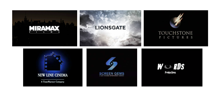
Hollywood Film Production companies
These logos are very bright and some have both writing and pictures. these logos stand out as they use bright colours like yellow or blue and bold writing. I think because of the bright colours and bold writing these logos are much more eye catching and more interesting to look at.

Independent Film Production companies
These logos are much darker in colour and much more simple that those of the Hollywood logos. However I think that the simple design works well and is still pleasing to the eye. Furthermore these logos are mainly words with a very simple image or shape.

Thriller Film Production companies
For the thriller logos i found that they were all very dark in colour; i think that this is a great look for thriller logos as it sets a dark yet mysterious mood and makes the audience get into the mood of watching a thriller.
Overall i think all the logos are attractive to the eye in different ways, and each logos set different moods which are through the use of colours, words or pictures. All the logos are simple enough and there is not too much going on in them which just looks a lot better. For our group film logo i think i would like to create a dark coloured logo with an image which stands out but that is simple. Furthermore i want our logo to set that dark suspicious mood for the thriller opening.
No comments:
Post a Comment